
- POP in - Diner & Bar
- Location — Gdynia
- Photographer — Tom Kurek
- Interior design — Sikora Wnętrza + Architektura
Playing with art and lighting in an industrial interior
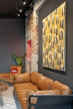
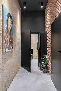
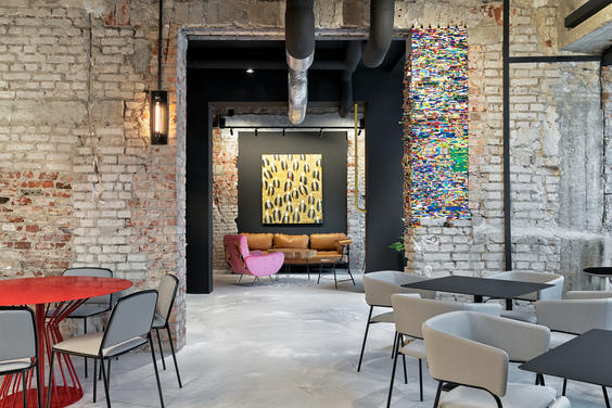
In the POP in - Diner & Bar restaurant, designed by Sikora Wnętrza, art meets culinary space. The entire interior was exposed by lighting, which was supposed to emphasize the industrial character of the place.
Playing with art and lighting in an industrial interior
In the POP in - Diner & Bar restaurant, designed by Sikora Wnętrza, art meets culinary space. The entire interior was exposed by lighting, which was supposed to emphasize the industrial character of the place.
Bricks under the rubble of the former beer house
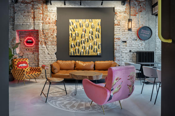
POP in - Diner & Bar is a new place of 189m2 in the center of Gdynia, which was established in the vicinity of the famous "Słoneczny" milk bar. The authors of the project are architects from the Sikora Wnętrza studio, and their adventure with creating this place was – as they say – extraordinary. Initially, the architects had to remove, using hammer, saw and dynamite, the existing interior of the beer house and get rid of the equipment of wooden platforms, columns, bar and coffers. Under the rubble, they discovered beautiful bricks that became the starting point for an industrial-style interior. The originality of the interior was emphasized by the delicacy and expression of an artistic gesture.
Illuminated art!
The main assumption in the project was to play with art. Inspiring were references to American Pop-art, compositions by Alexander Lieberman, mosaics from Central Park and paintings by Ewa Konieczna-Pilachowska and Andrzej Konieczny.

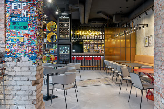
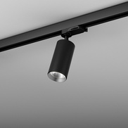
“This space is defined by humor and playing with the convention of a typical industrial style. The wall made of 24,000 bricks inspired by street art and wall stickers, has become one of the main elements associated with POP-in restaurant. The graphics were prepared by Jacek Wielebski – a well-known graphic designer and co-creator of Traffic Design. Such a project required the use of lighting that would highlight the interior and emphasize its qualities. We chose lighting on tracks from the AQForm brand, and more precisely the PET model, which was perfect for displaying the designed art” – says Jan Sikora from the studio.
PET track – the choice of Sikora Wnętrza studio
The project uses lighting from the PET family, which was to emphasize the industrial character of the interior and at the same time providing an interesting background for social meetings. The PET collection is characterized by a minimalistic design that fits perfectly into the industrial characteristics. Various available parameters and sizes of this family of luminaires make these lamps suitable for both high and low interiors and lighting projects of houses and apartments as well as public spaces such as restaurants and hotels.
PRODUCTSused in project
meet interior designers
Sikora Wnętrza + Architektura

Show us your project, where our lighting was used!
Photos are the best source of inspiration. It is also a credible evidence of successful projects. That is why sharing photos gives us great joy!
Do you want to show the world your project, which uses AQForm lighting? Click the button below, send photos along with a brief information about the realization, and we will take care for the rest. :)
Your project may appear on our inspiration page, on social media, in print or even in recognized interior design magazines among other places. Make your project an inspiration for new, well-lit interiors!
